Responsive Websites_Adaptive Websites_Differences Between Responsive and Adaptive Designs
Table of Contents
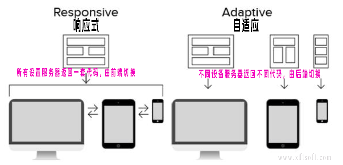
responsive
- Only one interface needs to be developed.
- Screen adaptation for web pages is limited to a certain range: for example, one set of adaptations for PCs (>1024), one set for tablets (768-1024), and one set for mobile devices (<768); responsive design, on the other hand, adapts all pages in one set. (You can imagine that responsive design involves much more complex considerations than adaptive design.)
- Create a webpage and use techniques such as CSS Media Query and Content-Based Breakpoint to resize the webpage to adapt to screens with different resolutions.
Adaptive
- Multiple interfaces need to be developed
- By detecting the viewport resolution, the system determines whether the currently accessing device is a PC, tablet, or mobile phone, and then requests the service layer to return different pages. Responsive design detects the viewport resolution and performs code processing on the client side to display different layouts and content for different clients.
- Different web pages are created for different types of devices, and the corresponding web page is called after the device resolution is detected.
Distinguishing between responsive and adaptive
- Open the website using a browser such as Chrome or Edge on your computer.
- according to
F12Or right-click and selectDetection。 - Click the top left corner of the panel.
Device switching iconAs shown in the picture below

- After switching,
The layout automatically switches between the desktop and mobile versions.responsiveFor example, this website;
If the layout doesn't automatically adapt, it will only switch to adapt after refreshing the page (whether the URL redirects or not).AdaptiveFor example, Baidu;
If refreshing doesn't switch, it's neither responsive nor adaptive, and therefore doesn't adapt to different devices.
suggestion
- From a development perspective: Single-page applications with complex functions should be responsive; simple applications should be designed to be adaptive.
- From an SEO perspective: Search engines generally prefer responsive design.
Summarize
- Responsive:
A templateThe front-end adapts to different screen resolutions, merging templates into a single page; downloading one template results in one page. - Adaptive:
Multiple templatesThe backend adapts to each resolution template, with one page per resolution, and different resolution templates are downloaded separately.